
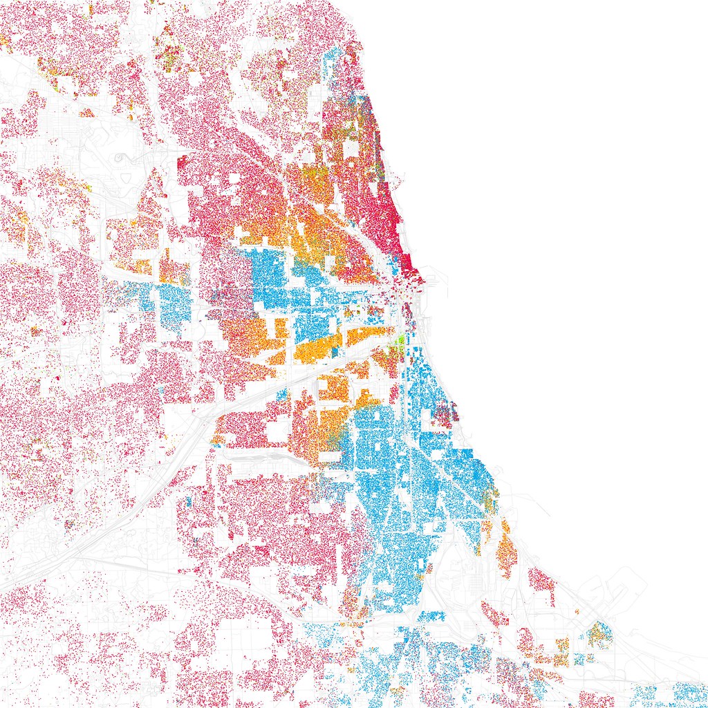
Map 1. Chicago
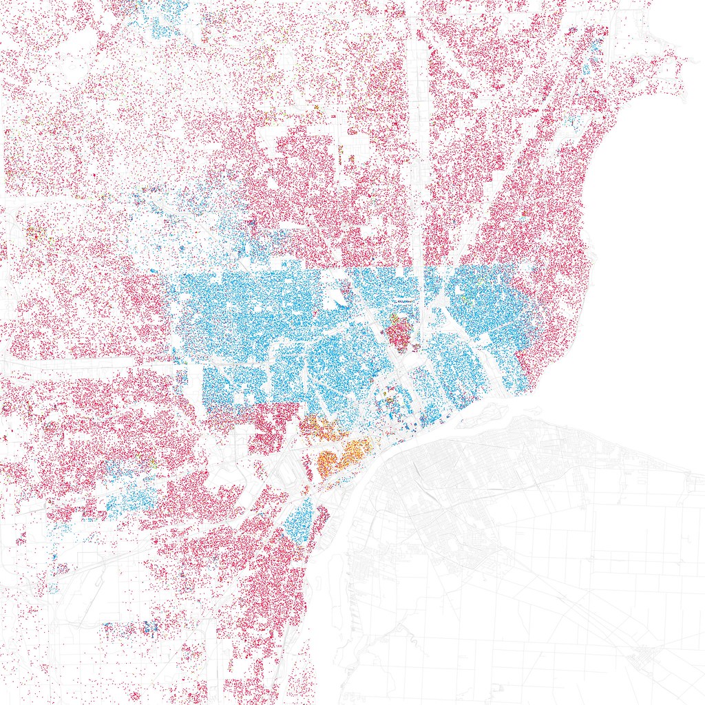
Map 2. Detroit
Many of you have seen the colorful maps which illustrate the geographic racial patterns of U.S. cities, bringing public awareness to the issue of residential segregation. One example of these maps were created by Eric Fischer, where he utilizes 2010 Census data to map the density and racial demographics of residents in major cities. The color-coded dots display the striking differences in metropolitan areas such as Chicago and Detroit, shown above.
The information presented in the maps is not news to residents of the towns represented. Many residents know the area of their town where Hispanics typically live or the neighborhoods where it is very unlikely to see a white family living. The maps reveal the stark separation of races that has been accepted by many citizens as local common knowledge.
For those Americans who believe segregation is no longer a prominent issue in the U.S., or think segregation has decreased because there are more integrated communities than before, these maps set the record straight.
So, why are these maps important, other than emphasizing what many already know to be true? How can these maps be useful tools for communities? These visual representations of racial residential patterns help community members link social problems with their locations. It helps us think about where problems exist in a city – high poverty rate, food deserts, lack of commercial districts – which are most often located in minority areas. The maps can help city leaders and residents involved in their communities to assess and create solutions to the needs of their neighbors.
Community leaders can also focus on the areas of a city that include a mixture of races living in the same neighborhood. It is important to first determine if those communities are integrated or merely diverse, with no intentional practices in place to sustain integration. We can also think about how these areas are different – what is going on in these neighborhoods and how can other communities follow suit? Neighborhoods that are purposefully promoting integrative strategies set an example for segregated communities, and locating these areas is the first step in changing the demographics portrayed in the maps. Integrated neighborhoods have a lot to teach segregated communities and are often happy to help their neighbors work toward the goal of integration.
The dot density maps provide a good starting point for cities to address issues that connect with racial residential patterns, and to re-focus on the issue of segregation. It is true that the number of integrated communities in the U.S. is increasing but, as showcased in these maps, there is still a lot of work to be accomplished to integrate our major cities.
By Casey Griffith, Research and Outreach Coordinator